New Website and Mobile design for Foundation For Intentional Community
Cross-disciplinary Team
UX/UI Designer
Figma
2025


Process
Initial Discovery and User Flow Mapping
The first two weeks were devoted to establishing a research foundation. The team mapped comprehensive user journeys across distinct user types: community members, FIC members, event organizers, donors, and prospective members. We documented key pain points in their current experience and identified where the existing information architecture created friction. This foundational research provided the framework that would guide design decisions throughout the project, ensuring each iteration remained grounded in user needs rather than aesthetic preference.
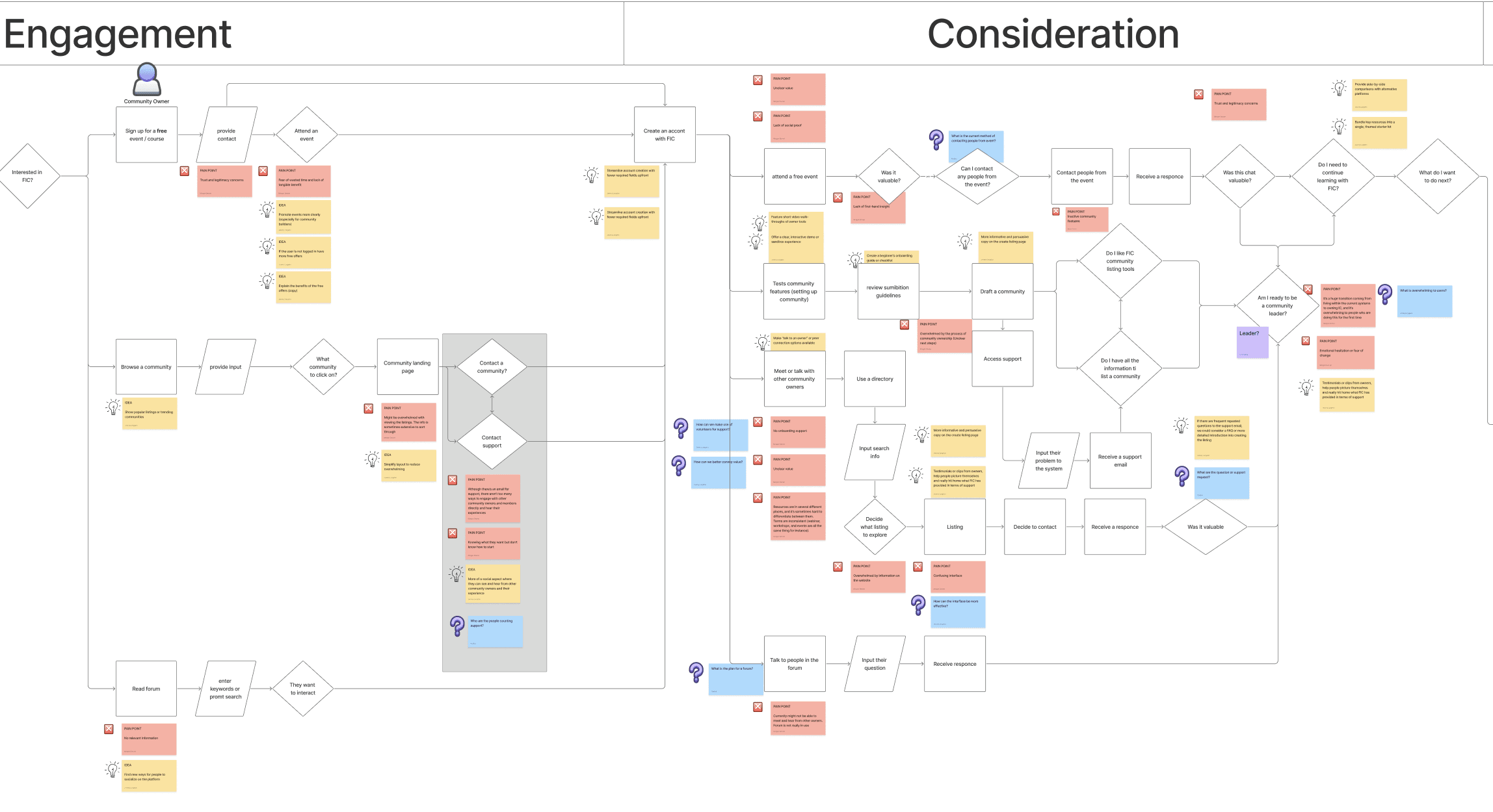
Below is a small snippet of a much larger CX mapping flow chart for current community members.
Collaborative Workflow and Structured Iteration
The UX design team reviewed work internally each Monday, presented iterations to the client every Wednesday, and conducted team debriefs on Fridays to discuss information hierarchy, page logic, and prioritization. This rhythm created a genuinely iterative process despite time constraints. As many team members were dispersed across the world, managing time differences seemed like a hurdle at first glance, however, timings were communicated and all members maintained respect for timing expectations.
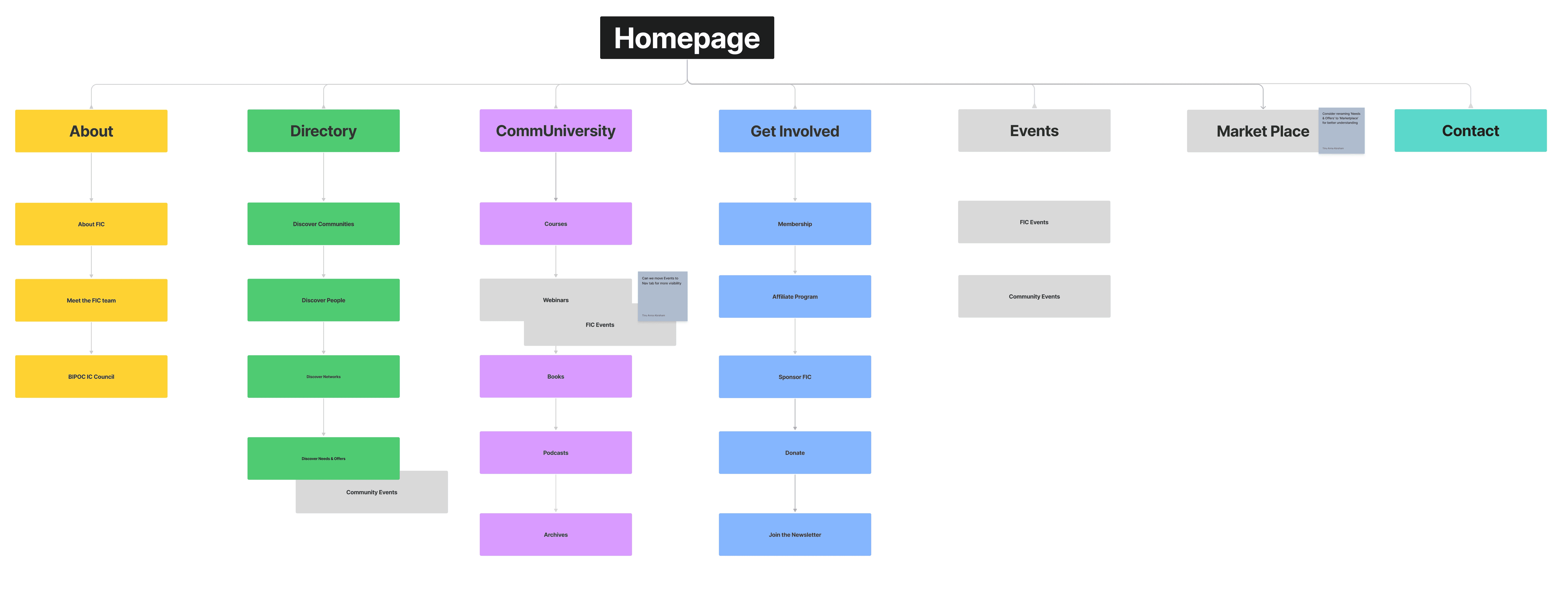
My responsibilities encompassed several key pages and components: the article page, the communiversity page, user navigation systems, settings, and various components across other pages. I also provided feedback to team members while receiving critique on my own work. Beyond the internal design team, the project required ongoing coordination with the client stakeholders and the development team to ensure feasibility and alignment.
Addressing Terminology and Mental Models
A hurdle that the team faced was tackling user confusion established through FIC's existing terminology. The platform allowed members to create "needs and offers" while FIC itself hosted "events." While these represented fundamentally different functionality and user intent, members announcing to the community versus FIC providing curated programming, the shared terminology obscured this distinction.
During our discovery phase, despite weeks of immersion in the system, the design team experienced the same confusion a new user would encounter. This gap between our own understanding and the user experience indicated a significant problem. The UX team advocated for a terminology change, such as "member marketplace", language that would immediately resonate with users familiar with established platforms like Meta or Etsy.
Design Under Constraints
The project proceeded without formal UX research or user testing. Rather than compromise the design process, the team adapted by leveraging the user journeys and pain points established during initial discovery as a framework for decision making. This approach ensured that design decisions remained grounded in documented user needs. Therefore, the communiversity page structure was validated against established user flows. Navigation and settings were designed to solve specific friction points identified early in the project.
The team also developed a practice of internal critique that incorporated multiple perspectives. The UX research team contributed domain knowledge about potential issues. The development team provided feedback on feasibility. Client stakeholders grounded discussions in business objectives. While external user testing was unavailable, this collaborative review process brought guardrails to design validation.
Despite producing designs at high velocity, sometimes completing pages within one or two days, the pace reflected focused strategy rather than expedience. Each decision traced directly to either a documented user need or a business goal.
Solution
The redesign resulted in a comprehensive set of assets provided to the client and development team:
Information Architecture and Systems
Complete information architecture flows documenting user pathways and content relationships
Design system establishing visual and interaction patterns for consistency across the platform
Page Designs The team delivered high-fidelity designs for the following pages and templates:
Books, Articles, and Podcast pages (content discovery and engagement)
Profile pages (community member profiles and organizational profiles)
User profile and settings pages (account management and personalization)
Courses page (learning and educational content)
Events and Member Events pages (distinguishing FIC-hosted programming from member-created announcements)
Needs and Offers page (member marketplace functionality)
Network profile page (community connection and relationship management)
Communiversity page and associated search results (comprehensive search and discovery interface)
These deliverables provided the development team with clear specifications for mobile and web implementation while establishing a cohesive experience across the platform.
Takeaway
Establishing Communication Infrastructure Early. Communication with the client and development team was strong, but communication with the UX research, product strategy, and project management teams was limited. The fast paced iteration cycle consumed the team's capacity, and once that rhythm was established, it became difficult to add structured communication channels. Distributed time zones and part time availability compounded this challenge. The experience highlighted that communication structures need to be intentional and established early, before momentum takes hold. Implementing task specific Slack channels and asynchronous documentation systems at project start would have created space for collaboration that emerged organically too late. This taught me that infrastructure for communication is as important as infrastructure for design, and that the best time to implement it is before the need becomes urgent.